Logos
I've had involvement with logo design in one form or another throughout my career. In my earliest internship days, I got to take part in identity development for small business clients and was eventually responsible for branding and collateral design at my first agency job. Since then I've worked for numerous individuals and organizations of all sizes on everything from simple logo updates to full-on rebranding initiatives. These are a few of my favorites.
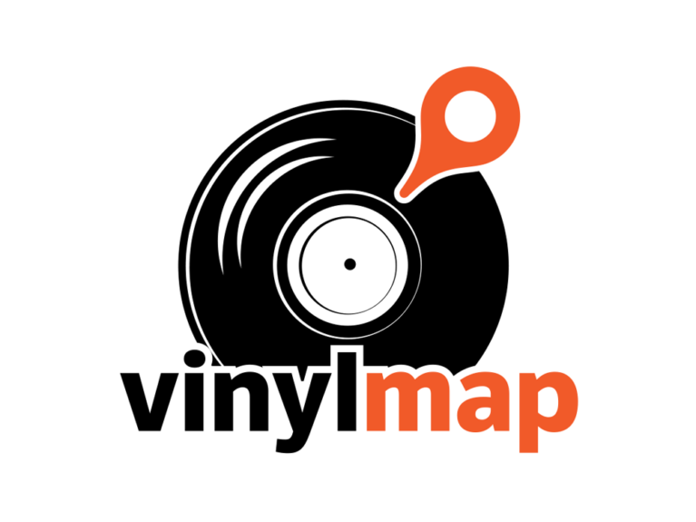
Vinyl Map
This logo was a lot of fun to work on. It was for a project on locating great record shops in specific areas, hence the map pin used in place of the tone arm. It needed to be a compact design and flexible enough for use on the web as well as an app icon. It also translated well into a sticker.
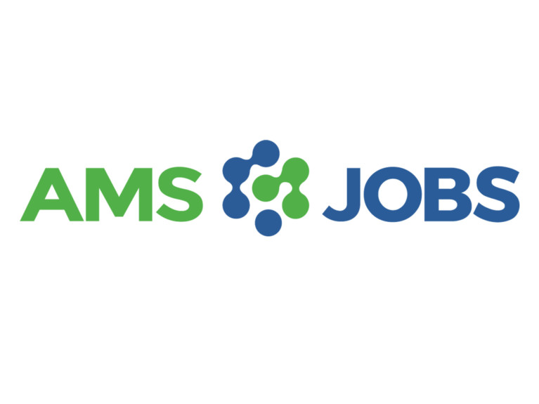
AMS Jobs
AMS Jobs is a site that helps connect job seekers and employers in the association industry. Concepts for the logo centered around that idea of connectivity and bringing together separate but matching pieces. The logomark represents these connections (and shows one yet to be made) and implies that it is a fluid and ever-changing process just like career journies tend to be.
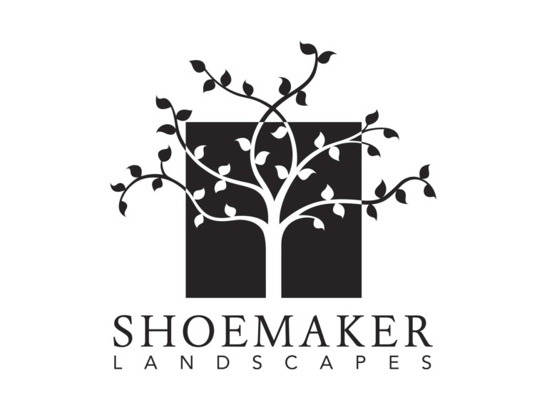
Shoemaker Landscapes
This high-end landscaping company serves the Washington DC metro area and surrounding regions in Northern Virginia and Maryland. Their clients consist of both residential and commercial properties. While they have a highly personalized approach to their more discerning clientele, they are proud to offer services no matter how big or small the job. When dealing with the owners, it becomes clear very quickly that there is a depth of knowledge and rarely seen attention to quality that would put any client at ease immediately. For the logo, I felt it was important to convey this understated sophistication and high level of experience. Using black and white in the logo and other marketing materials helps to set them apart from the competition.

Joy Gathering
Joy Gathering is a creative retreat founded in 2018. But in reality, it reaches far beyond the event. It's a community. A family. A belonging place for kindred spirits. It was, in fact, inspired by one family's creative gathering tradition. The founder was fortunate enough to have been invited into this trusted creative circle of family members and close friends. The original family, a mother, and her daughters are represented by the five stars. I wanted the logo to have a lightness and ease about it to go along with the "celebrating creativity" tagline. I was honored to be able to contribute to this special project.
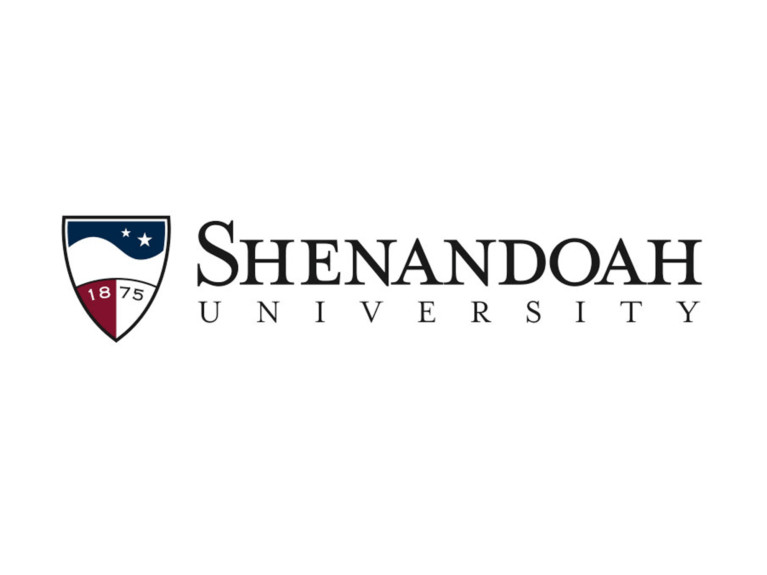
Shenandoah University
The decision to rebrand the university was made when I worked in-house as Senior Graphic Designer for the Office of Marketing and Communications. An outside consulting firm was brought in to perform market research and various other studies to help with the effort. A small group of us went to Denver to take part in a highly focused brainstorming workshop where we came away with a new direction for the university's image. Based on their research, the firm helped steer us in using the crest with the founding date for the new logo. From there, I worked to create and incorporate the other elements and finalize the design. The image in the top half represents the rolling Blue Ridge mountains that border the Shenandoah Valley to the east. The stars stand for the original campus location in Dayton, Virginia, and the current home of the university in Winchester, Virginia. Other versions of the logo include a seal as well as versions for each of the university's schools and main departments.
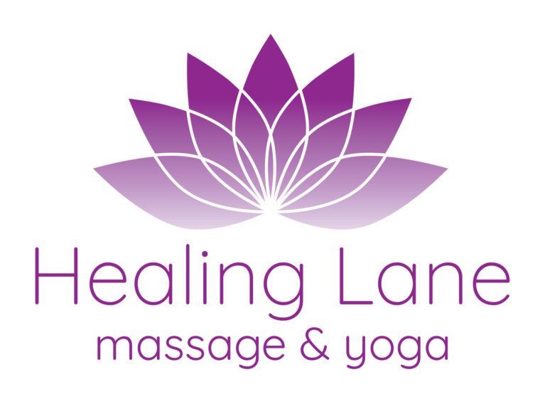
Healing Lane Massage & Yoga
The first version of this logo was designed for massage therapist, Gwen Lane, who was simply using her name for her practice at the time. She subsequently earned her yoga instructor certification and wanted to update her brand to reflect her new offering. We settled on the name "Healing Lane" for her business as it more fully embodies her approach to whole-body healing through massage and yoga. For the update, I also redrew the lotus image and stripped it down to only 1-color with a gradient, giving it the feel of a healthy glow.
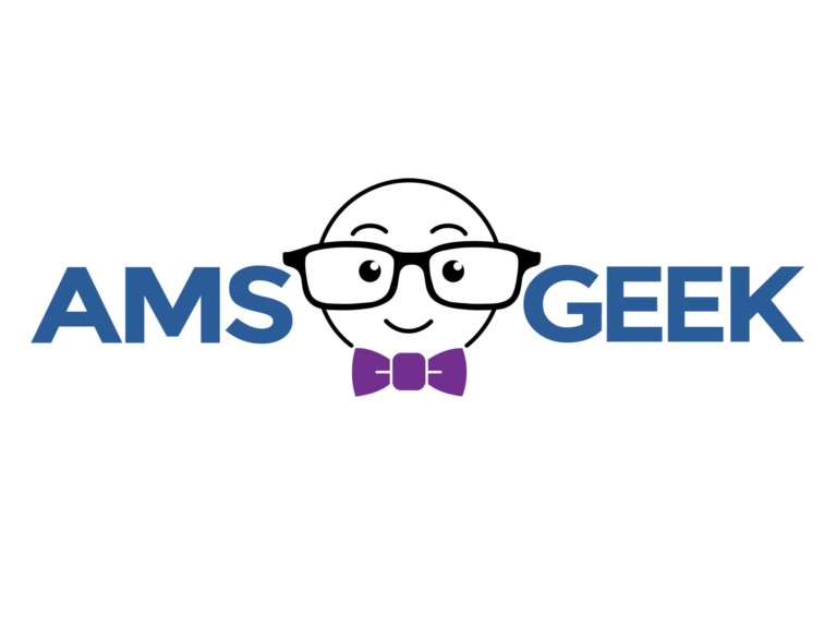
AMS Geek
This small startup was created to fill a gap that the owner, Ben Muscolino, saw after years of working with association clients. They needed a knowledgeable and trusted advisor to help solve their business, technological, and member needs. Ben is the AMS Geek. The logo conveys Ben's friendly and helpful nature, while the same font and blue were used to loosely tie it together with AMS Jobs - another of Ben's business endeavors.