
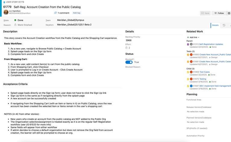
Case Study 1: A Better Self-Registration Experience

The Meridian platform is an enterprise learning management system (LMS) that specializes in complex training environments. Many of our clients use single sign-on and HRIS feeds, but for those who allow their users to create accounts themselves, this self-registration feature is key to starting the onboarding process.

The Problem

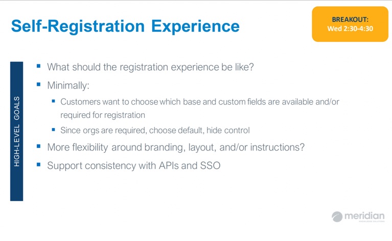
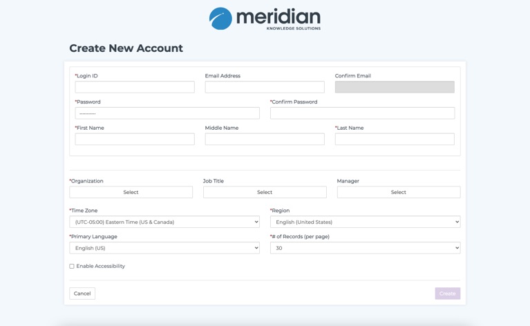
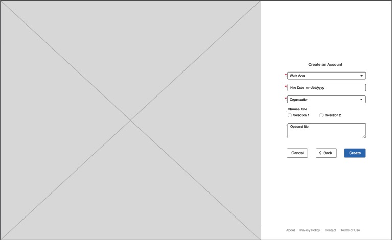
Users were having a difficult time creating new accounts from the login page. They were taken to a separate page with a long and dated form. The page was not responsive and they were faced with many fields (some required and some optional) many of which were unnecessary and confusing for a new user to understand and fill out. Our clients also needed a way to gather specific information from their end-users (we call them learners) at this important step prior to onboarding.

The goal of this project was to update the presentation of the account creation process, simplifying it for learners, and giving administrators new tools to customize fields and choose which ones to display. Along with most of my projects on the LMS, this one involved design for both the admin and learner experiences.

My Approach

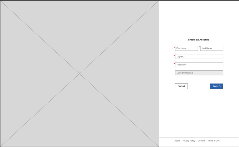
As the Product Designer for this feature update, I worked closely with my Product Manager to understand the issues we needed to address. Once I was more clear on the problem, I wireframed my ideas and ran design review meetings with my engineering counterparts to be sure we could technically do what I had proposed. Other internal stakeholders familiar with the feature were also invited to the design reviews to give their feedback on the redesign. Next, I worked with my UI designer who coded up the prototype. I then ran a functional review with my scrum team who would be building the new workflow.

After all of the preliminary design work was completed, I moved into writing the user stories – descriptions, workflow steps, and acceptance criteria. The backend developers worked from the user stories when implementing the changes and QA team members used the acceptance criteria as guidelines for testing.

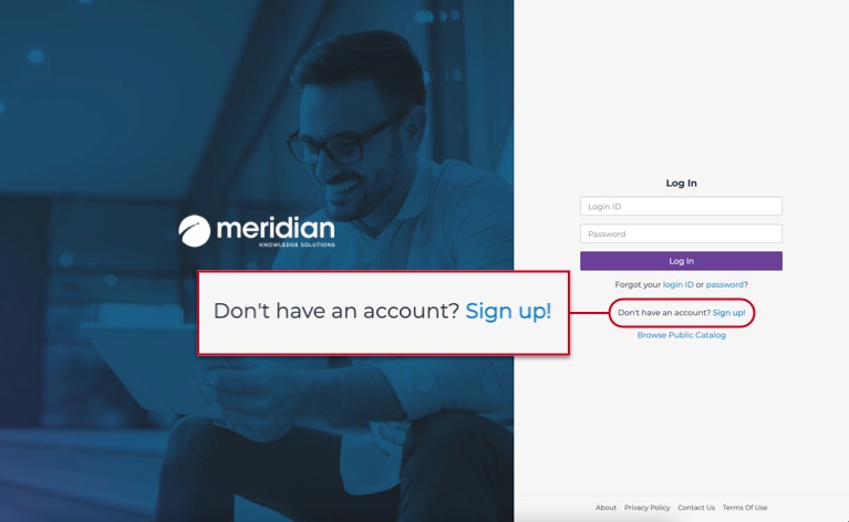
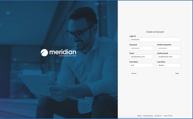
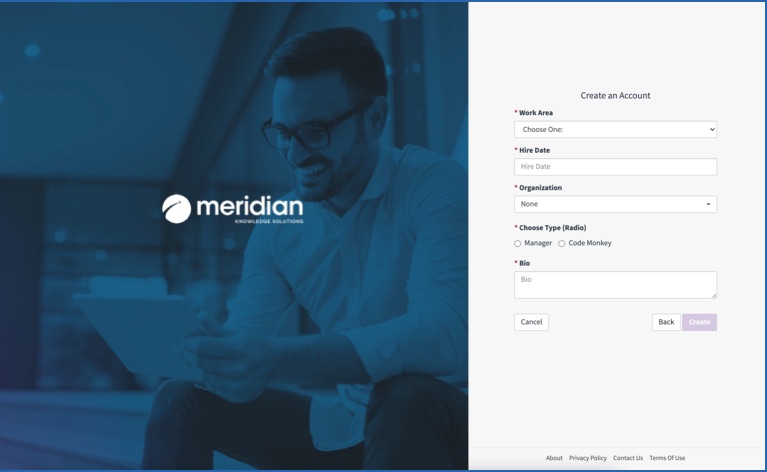
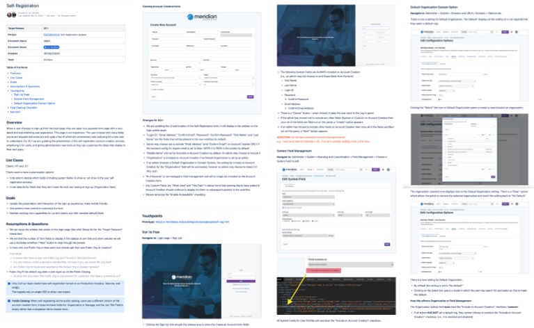
Below are some of the key screens showing how the work progressed for the learner experience.

Design Begins

The system already had the capability for users to self-register. This redesign included an audit of what was already being used and figuring out which functionality we needed to maintain versus what to deprecate. Armed with that information, I moved on to how we might enhance the experience.
Self-Registration

Kickoff Requirements from PM

The first step was an introduction to the feature from product management. This was part of a larger release kickoff, where several features were introduced to the team. Self-registration included breakout sessions to dig into the requirements outlined here.
Self-Registration

Existing Login Page

As mentioned above, the system had an existing self-registration feature. So to start off, I used the option already shown on the login page.
Self-Registration

Original Registration Form

This is where the changes started. The original registration form was long and overwhelming to fill out. It was not responsive and impossible to complete on mobile devices.

Wireframes

Prior to starting on the wireframes, there was just enough time for a short research phase that included analyzing usage data and interviewing stakeholders. I then ran several design reviews where I presented the wireframes so that we could get feedback from our internal, client-facing stakeholders and input from engineering on any technical needs or restraints. The following wireframes show a simple learner self-registration workflow.
Self-Registration

Wireframe 1

Upon selecting the signup option from the login page, the learner is immediately shown the first step in the same area. Rather than take them to a separate form page, I decided to use the existing sidebar section where the login process takes place. Thus allowing for a more streamlined workflow. To reduce clutter and extra cognitive load, I chose to use an in-field display of the form labels.
Self-Registration

Wireframe 2

One of our requirements from an admin perspective was to allow the form to be highly customizable. This meant there was a need to accommodate a short and simple form as well as longer forms with potentially many fields, both required and/or optional. I came up with the plan to use a multi-step process for the longer forms. As the learner completes all of the required fields, they are given an option to progress forward, or, if applicable, to go back to the previous step. Once they reach the end of the form, they are presented with the option to create their account.

Prototype

Once I vetted my design with the team, the next step involved working closely with my UI designer who created our hi-fidelity, coded prototype. Using the prototype, I then ran functional reviews with engineering, product management, and QA to ensure that everyone working on the project was on the same page. The prototype followed the wireframes closely and allowed the specific UI elements to be represented in their final display and to be fully interactive.
Self-Registration

Screen 1

Screen one of the prototype shows how we present the in-field labels prior to being filled out by the learner. This could be seen in the wireframe as well.
Self-Registration

Screen 2

Here, the prototype shows how we handled the in-field labels after the learner has begun to fill them out - the labels switch to display above their respective fields. The usability problem that presented itself, was that once the cursor is placed in a field, the label would disappear, forcing the user to clear out the content if they wanted to verify what the original expectation for the field was.
Self-Registration

Screen 3

The final step in the workflow is represented here as it was shown in the second wireframe. The user has the option to go back a step, or they may complete the form and create their account.

Documentation

Throughout this project, I was responsible for certain other artifacts such as the user stories and the design documentation.

User Story List

Together with PM, we created user stories for each of the steps needing to be implemented for the feature. As a smaller feature, this list was fairly short but involved lots of different expertise from across the team.

User Story Detail

This is an example of a specific user story that covered implementing the self-registration workflow from a completely different area of the system. Because the system is so large, there are often alternative ways to do similar things. I wrote the description and acceptance criteria for this and other user stories for the self-registration redesign.

Design Document

I created and maintained the design doc for this feature. The document serves several purposes. It's a place to record the background and requirements for the feature, it houses the research finding, it includes the annotated wireframes/mockups, and details the workflows that are used to produce the user stories. It is meant to be referenced by developers during implementation, and QA during testing. Finally, once the feature has been deployed, it serves as a historical document that can be used by any internal audience as needed.